The visual + verbal source of truth for Coterra. Direction A — heritage outdoor mood lifted by editorial typography polish. Use this page as the canonical reference; if a screen disagrees with what's here, fix the screen.
Seven tokens. Terracotta on cream is the brand signature. Pure white is forbidden as a canvas; pure black is reserved for ink emphasis on print.
Three families from Adobe Fonts (kit sqp4bwn). DM Serif Display owns the wordmark and hero. DM Serif Text owns editorial body. Pacaembu owns everything else.
Display + wordmark. High contrast, editorial. Used at h1 / hero only — never at body size.
Family travel, trail-tested.
What we figured out.
The summit is the family.
Editorial body. Country playbooks, longer-form prose, compliance copy. Italic for emphasis.
For travel to Brazil from the United States, plan for yellow fever vaccination at least ten days before entry. Children under nine months are exempt. Carry the WHO Yellow Card with the rest of the family's documents — it's checked at the border, not at airline check-in.
The Yellow Card is paper. Bring two copies.
UI body, buttons, labels, navigation, form text. Reserve thin/extra light for display-scale moments only.
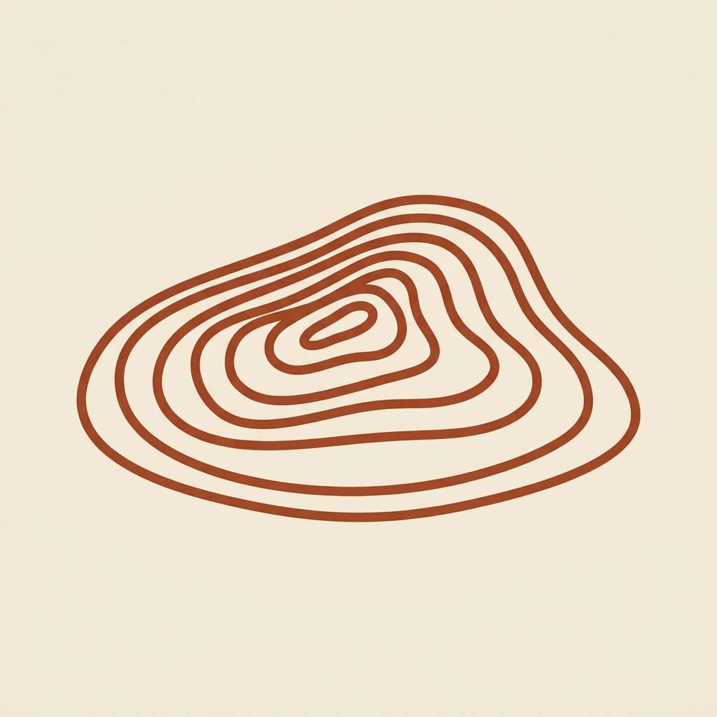
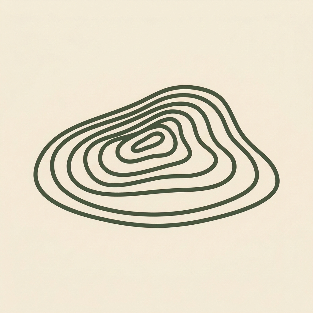
Topographic contour island — asymmetric hill at low angled perspective, smooth flowing curves. Reference renders below; production mark being redrawn as clean vector. Three application contexts: cream (primary), terracotta (inverted), moss (alt).


Note: Reference renders are AI-generated concepts (Higgsfield nano_banana_pro). Production assets being redrawn in Figma.
Subtle motion that earns its place. Every animation here respects prefers-reduced-motion. Three brand-signature moments, four button feedbacks, four form behaviors, two stateful patterns. Nothing bouncy. Nothing playful. Calmly authoritative motion.
On first load, the Coterra mark rings out — contour rings expand from center, like a pebble dropped in water.
A thin wavy contour at the top of viewport fills horizontally as you scroll the page. Look up — it's already there.
Move slowly across the primary button — the darker spot tracks your cursor position. Subtle, not flashy.
Press-and-hold to feel the inset shadow + 1px translate. Restrained, just-perceptible.
Click to enter the loading state. Three terracotta dots pulse left-to-right. No spinning circles.
Click to submit. Button shows loading, transforms to moss-green checkmark, then returns. Replaces a toast.
Type or focus the field — the label slides above the input in micro-caps terracotta.
Type an email. After ~600ms pause, a small validation message fades in (moss for valid, rust for invalid).
Tab through these fields — the terracotta focus ring draws in instead of snapping.
Help copy stays hidden until the user focuses the field — keeps form scanning quiet.
Click to trigger a notice. Slides in from the right with a soft scale, dismisses itself after ~4s.
Scroll the page — the ochre underline in the top subnav tracks which section is currently in view. Hover any subnav link to see the underline expand from center.
↑ Back to topPrimary CTAs in Pacaembu Semibold 600, all caps with 5% tracking. Sentence case for secondary and ghost. On-dark backgrounds, the secondary variant flips to a fill on hover.
Secondary buttons on dark backgrounds use the .btn-on-dark modifier. Hover fills with cream and flips text to terracotta.
Works on moss too — hover still inverts cleanly.
Default link is ink-text with an ochre underline at 2px / 4px offset. Hover lifts text to terracotta and underline matches.
Yellow fever for Brazil is straightforward if you start early. Check the lead-time guide at least ten days before your departure. For a subtler footnote-style link, use the subtle variant — same affordance, less emphasis.
Inline link inside body copy: trip prep checklist. Subtle link inside body copy: terms of service.
Small inline pills for status, category, or emphasis. Use sparingly — too many pills makes the page feel like a SaaS catalog.
In context — flight status example:
American Airlines · Brazil to New York · departs Tuesday 09:40 On time
Eight card variants. White has no border (sits on cream cleanly). All other variants get a border in a darker shade of their fill — never a generic grey.
Find out what you can bring back before you pack the carry-on. Five destinations at v1; founder-curated.
Three separate bookings, one family-trip view. Codeshares matched. Lap-infant tickets linked.
Apple Wallet Pass + printable PDF. Per-trip, per family member.
Inverted moments. Reserve for founder-narrative + CTA cards.
Success / confirmation moments. Lives next to checkmark icons.
Highlight / advisory blocks. Friendly attention-grab without alarm.
For high-contrast section breaks or premium / compliance content.
Hard error / blocking issue. Use only when action is required.
Minimal weight. Sits well alongside denser cards without competing.
Inputs sit on white inside cream-canvas pages. Border is an oat-darker shade (never grey). Focus state lifts terracotta border with a soft ring.
Three list patterns. Topo for feature lists (custom contour bullets in terracotta). Checked for "what's included." Numbered with editorial serif numerals for step-by-step.
For structured data: customs items, family-member status, country playbooks. Quiet header in Pacaembu Semibold micro caps; body in Pacaembu Regular. Optional striped tbody.
| Family member | Passport expiry | Status |
|---|---|---|
| Maria | 2031-08-12 | Valid |
| José | 2029-04-03 | Renew soon |
| Diego (14mo) | 2030-11-21 | Valid |
Big editorial numerals (DM Serif Display) with a Pacaembu micro-caps label. Use for landing-page social proof or country playbook headers — never as decoration.
Pull-quote pattern. DM Serif Display at ~28px with an ochre opening glyph. Attribution in Pacaembu micro-caps below.
We figured out the customs surprise at the security line, the three-airline-apps mess, and the packing math for each kid's age. Your next trip starts where ours ended. — Sean · founder
Left-border accent. Ochre for default advisory, moss for success, rust-deep for error. Voice stays plainspoken — no "Oops!", no "Whoops!".
Plan ten days ahead. Children under nine months are exempt.
Your family is ready for the Tuesday departure.
Most countries require six months of validity past your return date. Plan to renew before April.
Customer-facing accordion. Built on native HTML <details> / <summary> for keyboard navigation + screen-reader accessibility. Questions in DM Serif Display; answers in DM Serif Text. Chevron rotates 180° on open. Source content lives in the planning repo at kb/faqs.md (external KB) — every shipped feature triggers a sweep of that file, and this UI re-renders from it.
Entries above are pulled from the canonical source at kb/faqs.md (external KB) in the planning repo. Each entry there has a status field (live / building / deferred) — for entries marked building, the rendered answer reads as present-tense intention. When a feature ships, the status flips and the answer text is updated in the same PR.
### What is Coterra?
> `status: building`
Coterra is a family travel companion for parents who
used to travel internationally without thinking — and
now navigate every trip with kids...
Keyboard tab order, Enter to expand, screen-reader "collapsed/expanded" state — all free from the native element. We only style; we don't reimplement.
summary::after renders a chevron in terracotta. .faq-item[open] summary::after rotates -180° with a 260ms ease. No JS.
Each <details> opens independently. To enforce "one open at a time," wrap in a parent and set name attribute (HTML 2024+) — but the default multi-open is correct for help/FAQ contexts.
Under prefers-reduced-motion: reduce, both the chevron rotation and the answer-expand keyframe are disabled. The element still opens — the affordance is functional, only the motion is removed.
For lists that haven't been populated yet (no trips, no family members, no documents). Cream-on-cream dashed border, calm tone — never apologetic.
Forward an airline confirmation to your trip inbox and Coterra will pull together everything your family needs for the trip.
8px-based scale. Use tokens; never hard-code pixel values. --space-4 is the canonical rhythm (1rem · 16px).
Single-weight line icons, 2px stroke, rounded caps + joins. Matches the topographic mark's line quality. Inherit text color via stroke="currentColor". Use a library like Lucide; never mix line and filled icon styles.
Recommended: Lucide. Available in React (lucide-react) — same 2px stroke matches the system.
Sparingly. For env vars, hex codes, file paths, keystroke instructions. Never for marketing copy.
Add the Typekit kit to app/layout.tsx. The kit ID is sqp4bwn. The primary brand color is #A0492D.
Press ⌘ + K to open the trip search at any time.
Plainspoken. Gear-shaped. Slightly understated. Editorial polish, never folksy. Full voice guide lives at branding/voice-guide.md in the planning repo.